Sign up for the Family Tree Newsletter Plus, you’ll receive our 10 Essential Genealogy Research Forms PDF as a special thank you!
Get Your Free Genealogy Forms
"*" indicates required fields
Design Workshop
Are you a pusher or a sketcher? No, we aren’t prying into your personal affairs — just innocently asking what you do when faced with a pile of photographs, paper and embellishments. Some scrappers push around photos until they look right; others sketch layouts before even cropping one photo. It’s all good. Great pages don’t depend on the method, but on a few basic principles. See how we put these four design secrets into play, practice them for yourself, and you’ll be happy with your pages no matter how they come together.
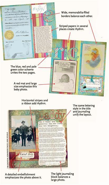
1. Emphasis directs a viewer to the most important part of your page, then to the secondary items. Without clear emphasis, either nothing seems to stand out or you don’t know where to look first. Usually your focal point is the best photo, but it also could be a memento or journaling. Make it stand out by increasing the size, matting it on colorful paper or cropping it into a different shape.
2. Rhythm keeps your eye moving from one spot on your layout to the next. Pages without this visual movement feel stagnant and, well, boring. Creating rhythm is as simple as repeating one or two elements — color, shape, texture or pattern — with a little variety. For example, use three shades of the same color or different sizes of the same shape.
3. Balance gives your layout a pleasing distribution of “visual weight.” Larger, darker and more-detailed papers and photos appear heavier than smaller, lighter, solid-colored ones, Imagine a vertical line down the center of your page, Compare the left and right sides — does one feel too light? Do the same thing, this time with a horizontal line. Is the page top-or bottom heavy? Rearrange the items until the layout looks balanced.
4. Unity means everything on your page works together — it’s not a collection of unrelated pictures and decorations. Some ways to unify a layout: Choose a color scheme of three or four hues. Limit yourself to one or two lettering styles. Add a border and coordinating embellishments. Select decorations with a theme in mind, such as spring, Christmas or Katy’s favorite toy. Before getting out the glue, stand back, look at your page and remove any distracting elements.
Power of the Pen
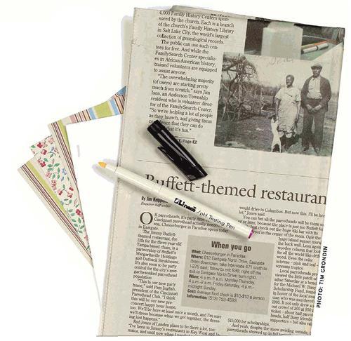
You’re not sure whether you need to encapsulate that 1972 greeting card before using it on Grandpa’s 100th birthday layout. Or the paper’s label says acid-free (or lignin-free, photo-safe, archival, buffered or pH-balanced), but you want to be sure. The solution? A pH indicator pen can put your worries to rest.
These pens contain a chemical that changes color to show which side of the pH scale your paper falls on. The scale ranges from 0 to 14 — a pH of 1 is highly acidic, 7 is neutral and 14 is highly alkaline. Acid-free paper measures 7 or above; buffered paper (which has alkaline ingredients to neutralize acid) also measures above 7.
You can get pH indicator pens, including Lineco’s (<www.lineco.com>), for about $5 at scrapbook stores and online retailers such as Archival USA < www.archivalusa.com>. Test your paper by using the pen to mark an inconspicuous spot — the mark will change color within seconds. Since the color differs depending on the pen, check the package to interpret your results. Testing pens work best on light-colored papers; dark papers make it hard to see the pen mark. Tear shiny, coated paper and test its inner layers, or scratch the surface to remove the coating.
Scrapbooking paper, photographs, memorabilia and embellishments resist the damaging effects of light (especially ultraviolet light) to varying degrees. Light stability is different from lightfastness, which refers only to colors’ fade-resistance.
Safe Keeping: heirloom furniture
ADVERTISEMENT