? Don’t overload your site with animated graphics, cutesy backgrounds and huge, memory-gobbling photos. They’ll make your pages look cluttered and take an eternity to download. Use “thumbnail” (small) photos instead. If you want to include a large picture, put it on a separate page with a link such as “See full size” next to the thumbnail. Then users can decide if they want sit through the download.
? Do stick with simple, easy-to-read type. Co easy on the use of italics. Make sure there’s adequate contrast between your type color and your background.
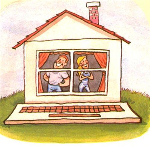
? Don’t try to post everything on your home page. Your home page is the front door to your site — use it to link to and promote what’s within. Not only do Web surfers tire of scrolling through miles of text, making your home page an “index” allows you more flexibility when you want to add new material later.


