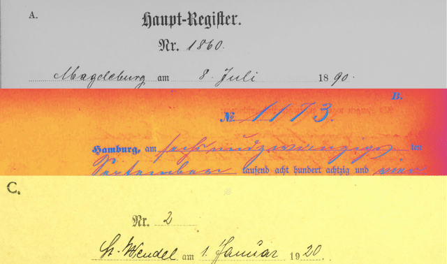
Deciphering the handwriting or print of Germanic documents may be the greatest challenge in researching your Germanic roots. You don’t need to read German fluently to be able to decipher most genealogical records. But you must learn to recognize the most common genealogical scripts and prints. This is absolutely essential since very few German records have been translated.
Older German records are prepared in letters similar to the style called Kurrent. We’ve also illustrated two other styles, called Fraktur and Sutterlin, to help you see the connection between Kurrent and modern styles.
Certain Kurrent letters appear very similar. This can make your interpretation of Germanic documents difficult and lead to confusion. The handwriting of individual priests, ministers and clerks can vary significantly from one to another, creating further confusion. The idiosyncrasies of each individual’s style of forming particular letters can be baffling.
To be effective in translating a particular person’s handwriting properly, make photocopies of enough samples of one person’s writing to be able to decide what the letters are. By becoming familiar with numerous common words written by that person, you’ll better be able to decipher each word in that person’s handwriting.
As you’ll notice, the uppercase S is often mistaken for C, E and G. In addition, you can easily confuse the following pairs of uppercase letters: the V and B; I and J; and N and R. Likewise, the lowercase letters h, n and y are difficult to differentiate; f and s look alike, as do c and e and i and j. The lowercase k can also cause confusion because it looks like a Roman font letter l with a line through it.
Receive your free copy of our Germanic Alphabet Chart by clicking the button below.
Get the Germanic Alphabet Chart in PDF format:
Get Your Free Genealogy Forms
"*" indicates required fields


