Sign up for the Family Tree Newsletter! Plus, you’ll receive our 10 Essential Genealogy Research Forms PDF as a special thank you.
Get Your Free Genealogy Forms
"*" indicates required fields
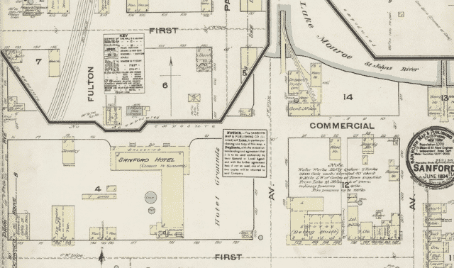
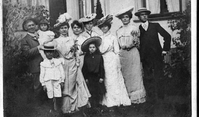
Many homes and neighborhoods no longer exist in the same way that they did when our ancestors lived in them. Imagine being able to identify a picture of a family standing in front of a home by comparing the features of the house to details drawn on a map.
You can use Sanborn fire insurance maps in a variety of ways to help tell your ancestor’s stories. They suggest what church or school they attended, what grocery store they shopped at, and how long their commute to work may have been. They can also help you identify house numbers, especially useful if deeds only describe a block and lot.
Read on for how this remarkably consistent collection of maps can light up your family history.
Sanborn Map Coverage
As they do today, insurance underwriters need to make assessments before they can cover an asset. Fire insurance companies, specifically, quantified the risk of a building catching fire, and the risk of the fire spreading to adjacent structure. They used maps that provided information relevant to fire risk to do so.
By the early 20th century, the Sanborn Map Company was the largest creator of fire-insurance maps. Founded in 1866, the company still exists to this day and created more than 1 million map pages. With coverage of roughly 12,000 US cities, their archive represents perhaps the largest and most-comprehensive collection of historical maps: depictions of virtually every significant populated place in the first several decades of the 20th century.
Sanborn maps were drawn to-scale (most at 1 inch for each 50 feet), then mounted on 21×25-inch pages and bound into volumes.
Some residents were concerned about strangers in their neighborhood paying careful attention to their residence or place of business. To help prevent confusion (and relieve suspicion), local newspapers would often publish notices when surveyors would be coming to town.
Clues in Sanborn Maps
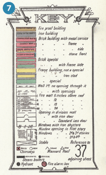
As we discussed, Sanborn maps were created to assess fire risks in a community. As such, they used colors, symbols and abbreviations to describe the buildings it depicts. And because they were made by the same company, those symbols are generally consistent from place to place and decade to decade. Still, a legend indicates meanings of these and other markings that appear.
Each included:
- road names
- street numbers
- building sizes
- construction material
- location of fire hydrants
- names of businesses and churches
- where buildings were on each lot
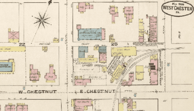
Of particular interest was construction material, a unique detail that other contemporary maps left out. Materials were color-coded: often yellow for a wood-frame building, pink for brick, and blue for stone and concrete.
Abbreviations described what the building was used for such as a D for dwelling and S for store. A single number within the house indicates how many stories the building was. Find a detailed list of Sanborn map abbreviations here.
Maps needed to be up-to-date to be useful, and so were revised to reflect structures being built, changed or torn down. To save money, the Sanborn company pasted updates over the most-recent edition of a map, rather than attempting to publish revised pages. The paste-on corrections sufficed until a new edition was eventually published—sometimes decades later. Edits were also generally listed in the front of a volume, though this might not indicate when the revision was made.
Navigating Sanborn Maps
Most Sanborn map volumes began with an index of street names, which serve as a kind of table of contents. Streets were listed alphabetically, then divided by address number or cross streets. (For example: an entry for Madison Avenue, with subdivisions for 1000–1399, 1400–1699, etc.) Sheet numbers indicate which page(s) depict that part of a locale.
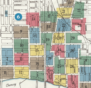
Volumes also generally included a visual overview of the covered area. Each section—denoted by a color—represents a page in the volume. (Note: Page numbers might not line up with the order of digital images you’ll see through websites such as the Library of Congress.)
Pages for each subsection of a place also indicate which sheets document the surrounding areas. This helps you understand how the maps “connect” to the north, south, east or west.
Accessing Sanborn Maps
Sanborn maps have been recognized for their unique historical value. Though created by a private company, they’ve been widely digitized and made available to researchers.
Libraries, societies and archives
Libraries and historical societies often hold Sanborn maps that cover the areas they represent. Because of their large size, the printed maps might be stored in closed stacks; ask staff to see if they’re available to patrons.
As with other materials held by libraries and archives, you can check websites such as WorldCat and ArchiveGrid to see if other institutions have volumes you’re looking for. State archives may also have copies.
ProQuest and FiMo
Reference databases ProQuest and Fire Insurance Maps online (FIMo) provide online access to digitized fire insurance maps. See if your local library subscribes to one or both services.
ProQuest’s collection has more than 600,000 pages. But because they were scanned from microfilm, the images are all black-and-white. FIMo’s images are color and cover other companies besides Sanborn.
The Library of Congress
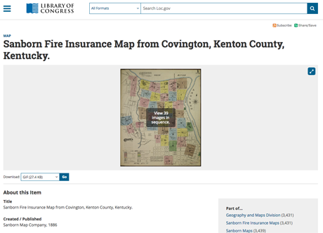
The single largest Sanborn collection—totaling some 675,000 maps—is held by the Library of Congress’ Geography and Maps Division. The collection is free, and much of it has been digitized in high-resolution, color images. More maps are added as copyright laws allow.
The site’s Advanced Search makes it easy to find maps. Use keywords and fields for country, state/province, county, city and date range. The collection includes some maps from Canada, Cuba and Mexico, and is strongest for the 1890s through 1920s.
Note that the street-name index is usually digitized toward the back of collections. In the original volumes, they were often at the front.
Sanborn Map Substitutes
No publication can quite replace the level of detail in Sanborn maps. However, the following documents can provide some of the same information:
Other companies’ maps: If you can’t find a Sanborn map for a particular area (or from a specific time frame), look for maps created by other companies. Sanborn’s competitors included the Rascher Insurance Map Publishing Company, the Fire Underwriters Inspection Bureau, and the Whipple Agency. The Library of Congress has a list of maps made by other fire insurance companies .
City directories: Like Sanborn maps, these chronicle the streets of an area—albeit in a different format. Directories listed residents and/or businesses by name and address. Use them alongside modern maps.
Deeds and land records: These contain certain details about a property: size, ownership, age and use. These may also mention adjacent buildings or construction materials.
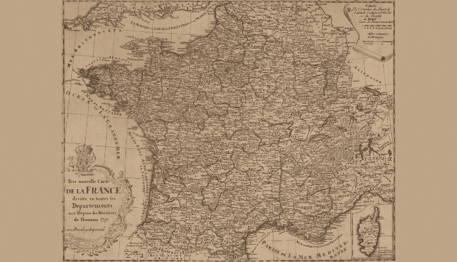
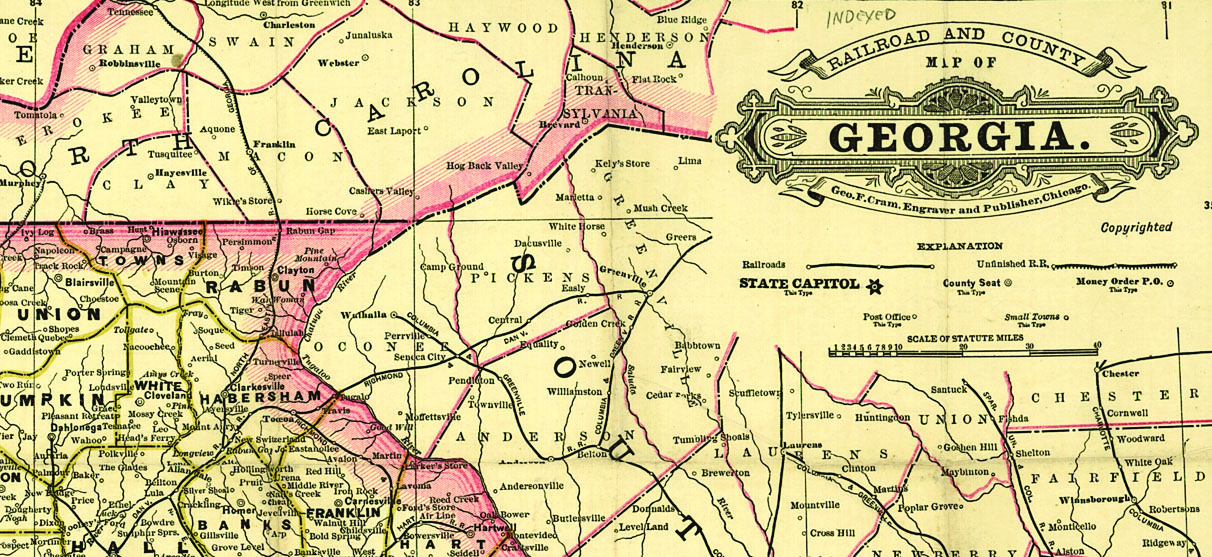
Other maps: Road, railroad and highway maps depict transportation routes and notable places in an area. Enumeration district maps and maps created for demographic purposes give clues to a place’s population.
Sanborn maps give you the ability to see the shape of a neighborhood that may no longer exist. What a wonderful gift for historians and genealogist.
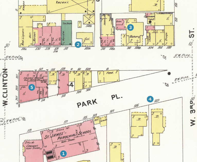
Sample Map
1. Numbers within buildings indicate how many stories tall they were. In this case, St. James’ Parochial School was a three-story building.
2. Dashed lines along the front of this Sal. (saloon) denote a porch.
3. Color indicates type of building material. This bakery, in yellow, had a wood-frame structure. The pink is an addition made of brick—according to the note, an oven (certainly relevant for fire risk!).
4. Numbers in front of a building are its street address.
5. This one building has several businesses: a cobbler, a sausage-making company, a motor company, and a smokehouse in the basement (marked with a B or BST).
6. Volumes begin with a reference page covering the whole region. Numbers indicate which sheets that part of a city or town are depicted on.
7. A key defines the various colors and symbols, which were remarkably consistent over the decades.
Tutorial: Searching for a Sanborn Map
By Diane Haddad
Here’s an example of how I used the Library of Congress’ Sanborn map collection to see where my ancestors lived:
1. Search for city maps
Much of my mom’s family lived in Covington, Ky., so that’s what I searched for (typing the full state name) in the Search box at the top of the page with “This Collection” selected. Maps were published in 1886 and 1894. (I chose 1886.)

2. Use city directories to find specific addresses
Next, I looked up a few ancestors’ addresses in city directories. In 1886, Louis Thoss lived and worked at a hardware business at 73 E. 12th st. His mother, Elizabeth, was a widow at the southeast corner (“sec”) of 13th and Garrard. His deceased brother’s widow, Jennie, lived at 165 E. 13th.
3. Explore indexes
Back on your Library of Congress collection page, find the index map image, then drag the viewer around to get a better look at street names.
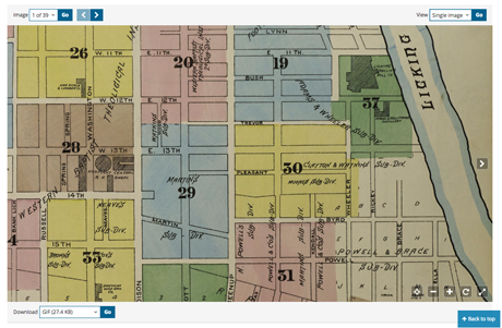
For larger cities, check the last page in the series for a street index that lists which range of house numbers and the map page they’re located on. It also lists “specials,” or major buildings.
The corner of East 13th and Garrard is on Map 30. Jennie’s address on East 13th could be on map 29 or 30.
I Googled Louis’ address to get a better idea of its location today. It’s probably on Map 20, but might be on a different map if houses have been renumbered since Louis’ day.
4. View single images or galleries
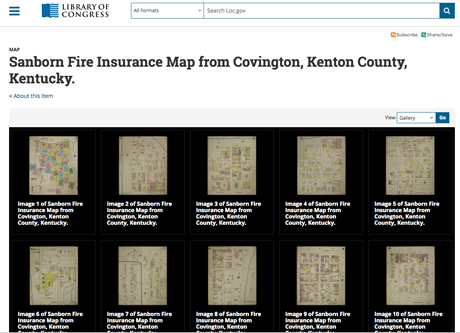
At the top right of the web page, switching from single image to gallery view and clicking Go gets me to the view of all map pages in this set, so I can find and click image 30.
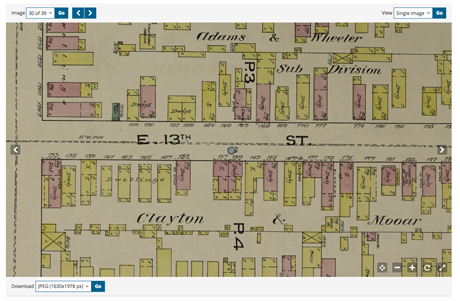
Here’s where it helps to check a Google map if you don’t know the area. Thirteenth street was shown running north/south, because it was probably positioned horizontally on the page. But in real life, it runs east/west. If I didn’t know that, I’d pick the wrong corner of 13th and Garrard. You can rotate the map using controls in the lower right corner.
Elizabeth Thoss lived at No. 133. No. 165 is 11 doors to the east.
5. Learn from colors and symbols
Elizabeth’s home is mostly pink and some yellow, with numbers and Xs, and the notation “no opgs” on the side. You’ll find a key on the index map page and more information about the colors and symbols here, along with notes such as the area’s population and size of the fire department.
Colors indicate construction materials. Green indicated a high-risk building. The numbers tell how many stories. An X marks a door, and Xes on walls mark windows, with dots for windows on second or higher stories. An O is an iron chimney. Elizabeth’s building was mostly brick (pink) and 2-½ stories, with a 2-story wood (yellow) addition. The front section held a saloon (“sal”), with a dwelling (“Dwg”) in the rear.
6. Download maps for future research
You can download this map in several formats, all the way up to a TIF, using the Download menu at the lower left.
Related Reads
A version of this article appeared in the November/December 2024 issue of Family Tree Magazine. The tutorial by Diane Haddad first appeared online in June 2017. Last updated: March 2025.

